By Ruth Rowland
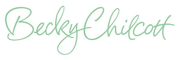
I was delighted to work on a logo for Becky Chilcott Design, a talented designer, working predominantly for the publishing industry.
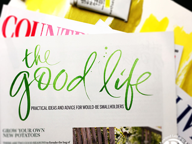
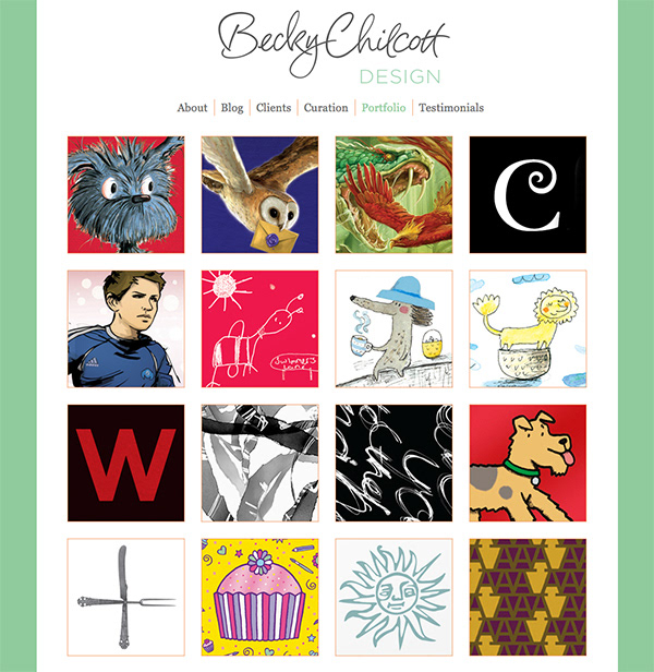
Becky wanted to keep the site fresh and simple, so we decided on a loose mono-line script with open counters and a flowing line to complement the grid layout. The cool palette of grey, green and white with a touch of red adds to the open, uncluttered feel of the site.
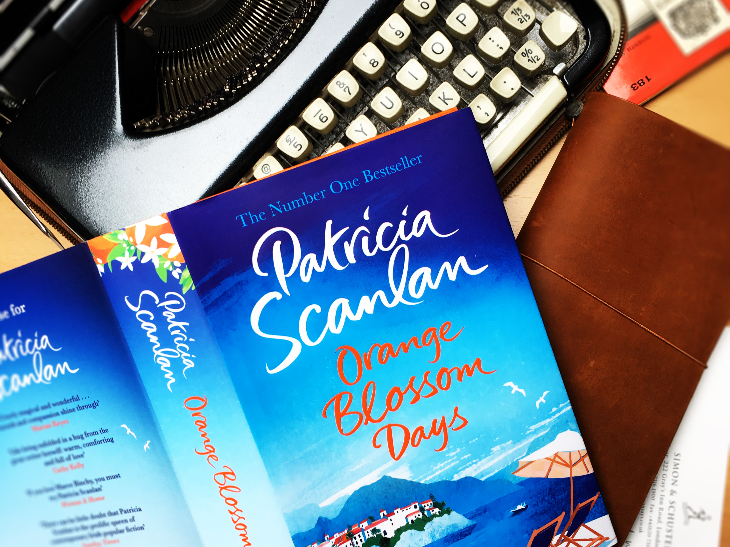
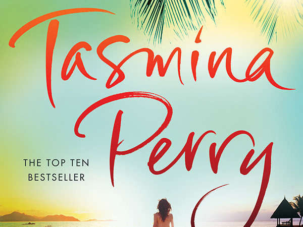
Over the past few years I’ve enjoyed working on a range of logos. Clients include entrepreneurs with new products and starter businesses, authors (for both publishing houses and self-publishers), musicians (established and starting out), restaurants, wine merchants, magazines, confectioners, food manufacturers, hotels and even stately homes. You can see a selection of this work in the logos folders in the menu above.
You can find more of my hand lettered logos in the dedicated folder in the menu, or head over to my publishing folder to see my work on book covers ...