By Ruth Rowland
The start of British Summertime means the clocks have gone forward an hour here in the UK, so with lighter evenings and the promise of finer weather, Spring-inspired news seems in order.
Few magazines do Spring better than Country Living, so here’s an update on some of the work that I’ve been producing during my ongoing project with Country Living over the past year. If you’re familiar with the magazine, you’ll be used to seeing my tonal watercolour lettering throughout its pages.
Designed to work within the page layout, the bespoke brush lettering complements the elegant typography but is still bold enough to sit across the beautiful photography. The work itself is produced by hand, scanned and dropped onto the page for fine tuning. This kind of attention to detail ensures the lettering perfectly matches the article’s colour palette and remains legible over any background texture.
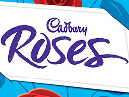
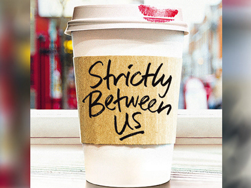
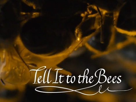
Aside from pullquotes, I also work on logos related to the magazine. Generally these are looser and more expressive, while still being carefully designed to fit within the space available - a fine balance between freedom and control.
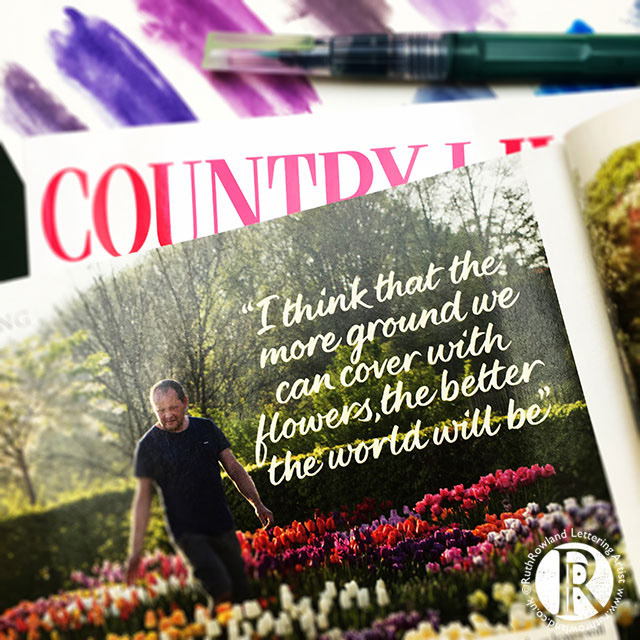
Hand lettered quotes for Country Living Magazine
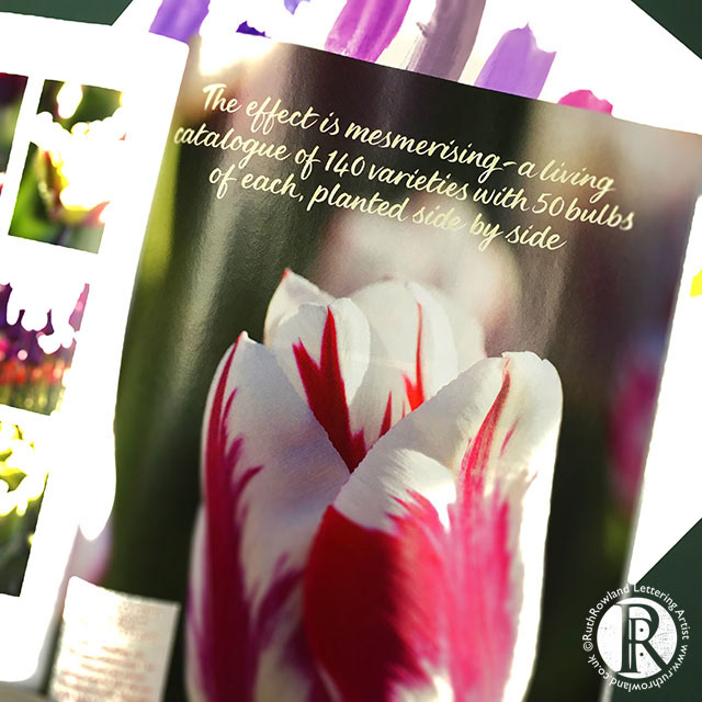
Hand lettered quotes for Country Living Magazine
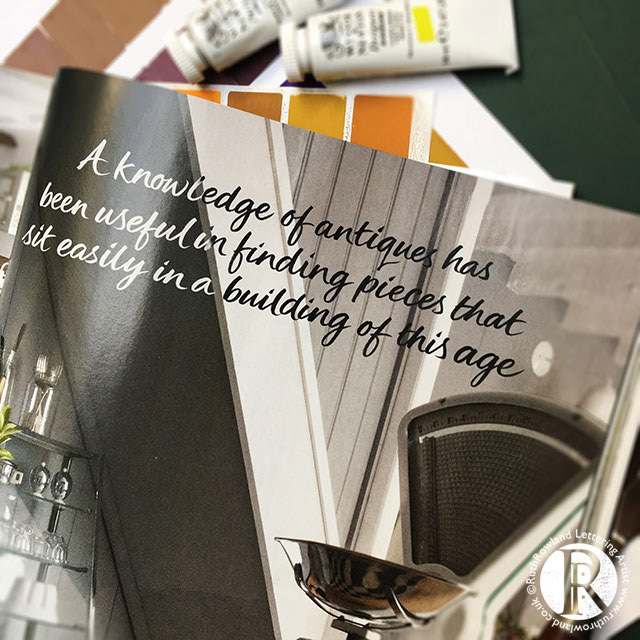
Hand lettered quotes for Country Living Magazine
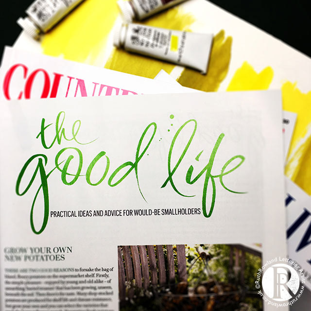
Hand lettered logo, The Good Life, for Country Living Magazine
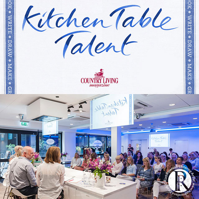
Hand lettered logo, Kitchen Table Talent, for Country Living Magazine
If you’d like to see more of my lettering work for Country Living or a variety of other magazines, head back to the editorial page for an quick overview ...