By Ruth Rowland
It was great to be asked to work on the Japanese-inspired hand lettering for Iron Maiden, on the boxset for their 17th studio album, Senjutsu.
Designer, Stuart Crouch Creative developed the Japanese theme across the boxset packaging with dramatic graphics and beautiful, bold illustrations. The album cover illustration you can just see in the background of the exploded view image, is by talented illustrator, Mark Wilkinson.
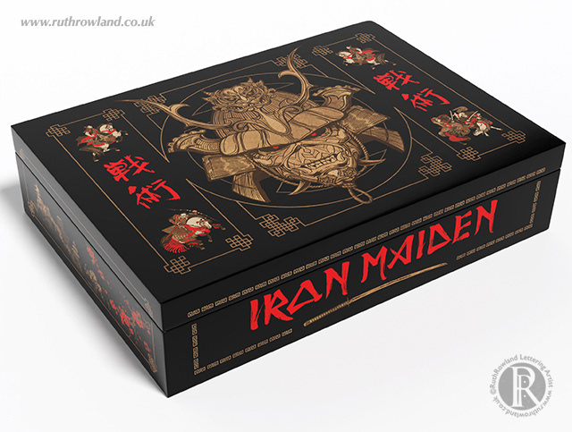
Japanese-inspired Iron Maiden lettering for the Senjutsu boxset: detail
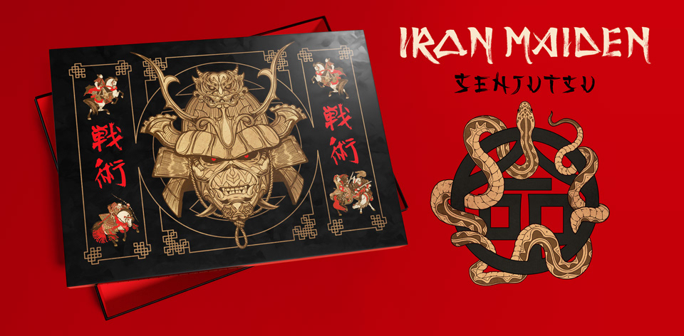
Japanese-inspired Iron Maiden lettering for the Senjutsu boxset: banner
I was delighted to be asked to develop a hand lettered version of the Iron Maiden logo for the side of the box. I often work with Japanese brushes and sumi ink, so I started out by spending some time studying the original Iron Maiden logo. This then helped me to develop a series of spontaneous strokes with brush, ink and paper, to echo the shapes of the letterforms. As with all my music commissions, the initial process is a dialogue between myself, the designer and the band, as the piece is developed to fit perfectly within the design.
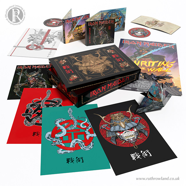
Japanese-inspired Iron Maiden lettering for the Senjutsu boxset: exploded view
See more of my work for the music industry in the dedicated folder, or if like me, you love Asian calligraphy, take a look at my Chinese kanji for Shanghai JCDecaux Advertising.
Alternatively, if you're interested in seeing an overview of the lettering I've created for the music industry over the years, you can find a list on Discogs.