By Ruth Rowland
I’ve had the pleasure of working with Country Living since the beginning of this year, when the design of this iconic magazine was refreshed.
I was asked by the art director to create a hand lettering style to reflect this fresh take on the magazine. After some experimentation we went for this soft but legible brush lettering with tonal highlights to complement the rich photography and stylish Didone typography that run throughout its pages. It seems appropriate that this lettering is bespoke, working closely with the art director, each individual piece is hand crafted to work within the beautifully balanced page layouts.
I’m looking forward to continuing the work, the lettering will gradually span all areas of the magazine from monthly article logos, to headlines and pull quotes.
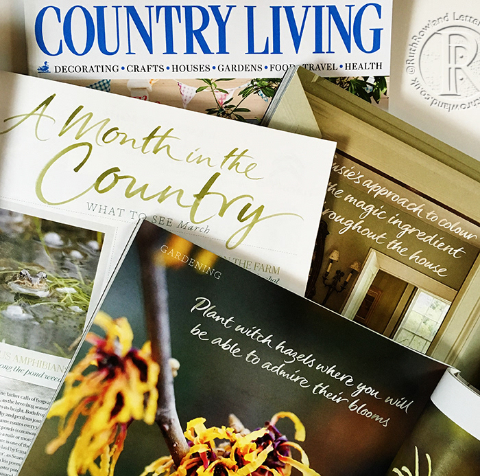
Lettering for Country Living Magazine: A Month in the Country Logo
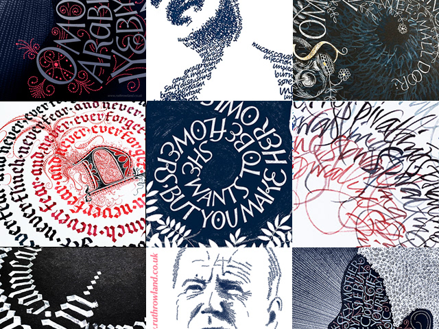
Hand Lettered Pullquotes for Country Living Magazine
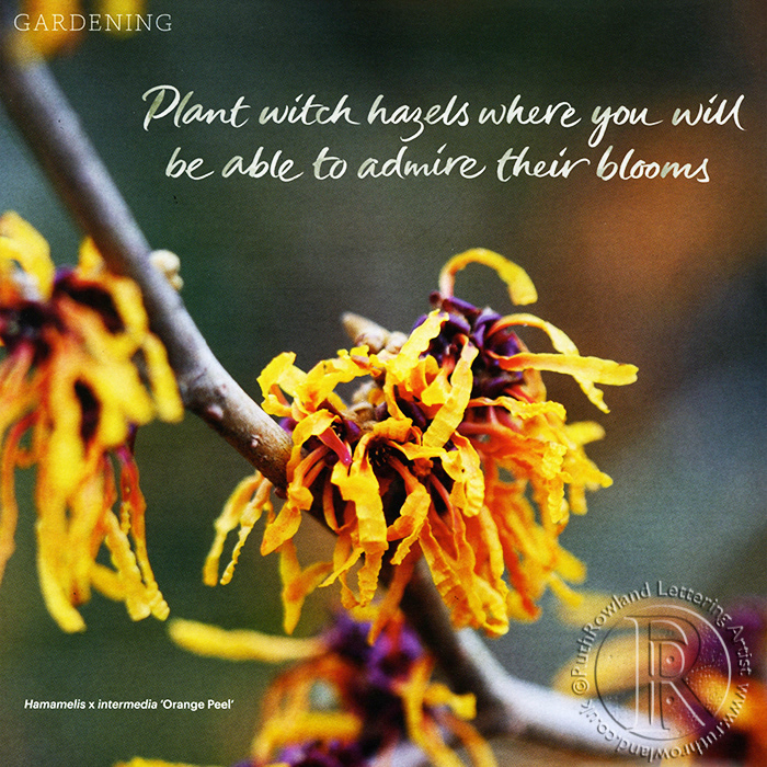
Hand Lettered Pullquotes for Country Living Magazine
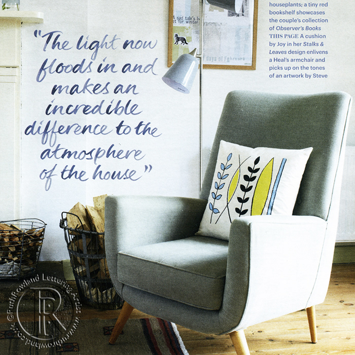
Hand Lettered Pullquotes for Country Living Magazine

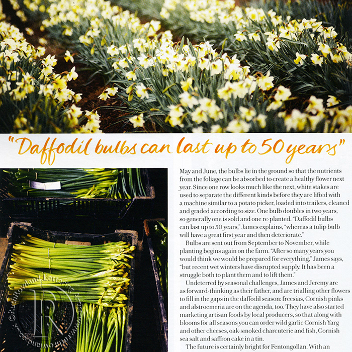
Hand Lettered Pullquotes for Country Living Magazine