By Ruth Rowland
It was a privilege to be asked to work on the hand lettered book title for Nicola Davies' wonderful environmental adventure, The Song that Sings Us.
The Song that Sings Us Book: Front Cover Title Lettering
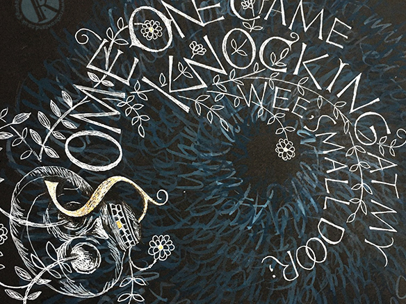
Designed by the talented Anne Glenn with beautiful cover and chapter illustrations by Jackie Morris, I wanted my title lettering to be in keeping with Jackie's fluid, watercolour strokes and iridescent colours.
The Song that Sings Us Book: Hand Lettered Title
This style of lively watercolour lettering was chosen to reflect the adventurous nature of the story and to work with the background map illustration.
The Song that Sings Us Book: Hand Lettered Title Detail
The forms that inspired these organic capitals have their roots in folk art, the expressive letters carved by local artisans, found in old churches and on road markers along ancient country byways. Their loosely structured majuscule forms helped to create the spiralling shape of birdsong for the cover title.
The Song that Sings Us Book: Front Cover
It was a challenge to shape the lettering to work as the starling's song and still be legible as the title of the book. As with most lettering, whether apparent or not, there were many revisions as I worked on getting the perfect balance.
The Song that Sings Us Book: Hand Lettered Title
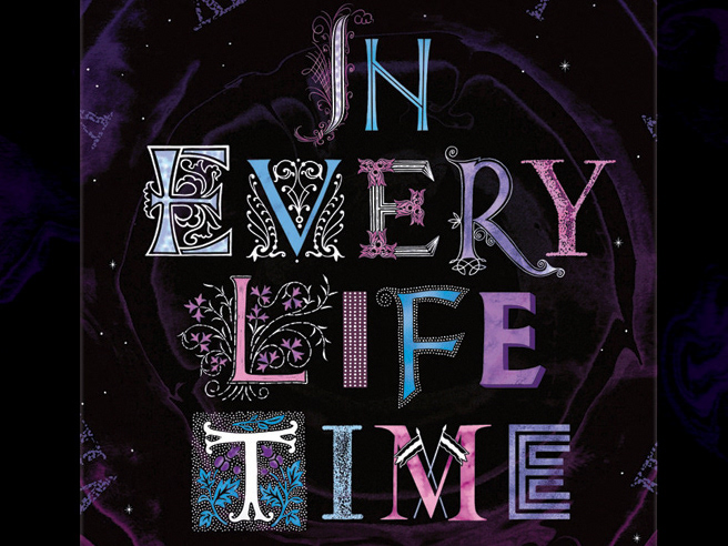
If you'd like to see more of my hand lettering on children's books, take a look at my logos for Scholastic Publishing's, Buster Bayliss and the Glitter Girls or if you'd like to see more expressive capitals or shaped lettering, take a look at my calligrams for The Owl Service and Zélie in my Illustration folder.
