By Ruth Rowland
I was asked by Stuart Crouch Creative to work on the lettering for Chrissie Hynde’s album, Standing in the Doorway: Chrissie Hynde Sings Bob Dylan - needless to say, I was excited to be included in the project.
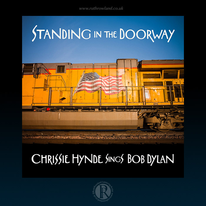
Standing in the Doorway: Chrissie Hynde Sings Bob Dylan: Front Cover Lettering
The songs were recorded in lockdown by Chrissie and her Pretenders bandmate James Walbourne:
‘A few weeks into lockdown last year, James sent me the new Dylan track Murder Most Foul. Listening to that song completely changed everything for me. I was lifted out of this morose mood that I’d been in. I remember where I was sitting the day that Kennedy was shot - every reference in the song. Whatever Bob does, he still manages somewhere in there to make you laugh because as much as anything, he’s a comedian. He’s always funny and always has something to say. That’s when I called James and said, ‘let’s do some Dylan covers’ and that’s what started this whole thing.’ – Chrissie Hynde
Chrissie Hynde was discussing the design and mentioned she loved the style of type on the original title sequence for the controversial 1974 cult film, The Night Porter with Dirk Bogarde and Charlotte Rampling. After some discussion, we decided the organic letters were Art Nouveau-inspired (which was having a resurgence in popularity in the 1970s). It’s hard to know how they were produced, some look like a regular typeface, while others look distinctly hand drawn or distorted with a camera - given the year, maybe rub-down type was used. However it was produced, it was this vintage, organic irregularity we wanted to reproduce, so I set about studying the key shapes of the letterforms.
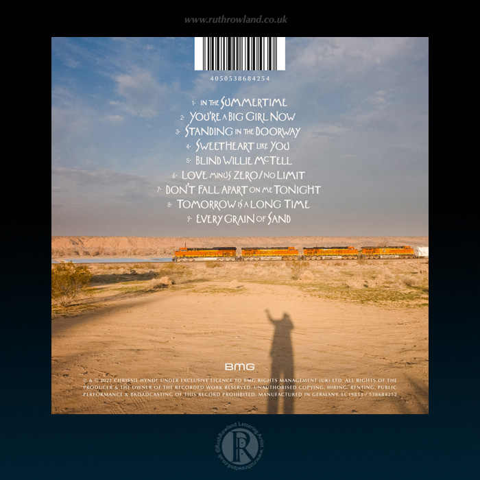
Standing in the Doorway: Chrissie Hynde Sings Bob Dylan: Back Cover Lettering
We started by capturing shots from the film title sequence and I began to draw up the album title in style, to work with Stuart’s layout. As you can imagine, this was a labour of love but when time allows, I really enjoy working on this sort of labour-intensive project. Once we were happy with the title, I started work on the tracklist, trying to give some balance and flow to the vintage type.
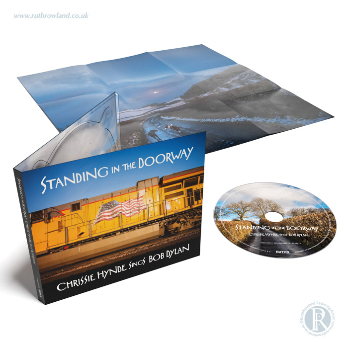
Standing in the Doorway: Chrissie Hynde Sings Bob Dylan: CD Lettering
Of course, it’s helped a lot by Tchad Blakes evocative photography. The striking photo of the train with the American flag was originally mocked up on the back cover but Chrissie loved it so much, Stuart flipped the design, so the train pairs beautifully with the horizontal flow of lettering above and below.
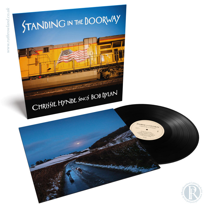
Standing in the Doorway: Chrissie Hynde Sings Bob Dylan: Vinyl Lettering
Designed solely for this album and its related marketing, the lettering is quirky and erratic in form, breaks all the rules but somehow it just works - for me, this is what custom lettering is all about.
Chrissie Hynde Sings Bob Dylan: Poster Lettering
I hope you enjoyed reading about this interesting project, if you'd like to see more of my work for Chrissie Hynde, you can read about my lettering for her Stockholm album in the Music folder.