By Ruth Rowland
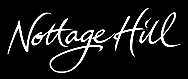
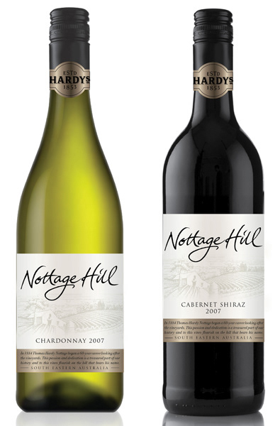
I was asked to work on the new logo for Hardys Nottage Hill as part of Accolade Wines' new packaging and promotion for the range.
The client wanted to re-tell the story of Thomas Nottage Hardy, their founder's nephew who worked for the family business for 66 years, having started as a boy of 15.
The wine is named in honour of him and the lettering is designed to have the familiarity of a signature, reflecting its rich heritage and identity, while retaining a strong fluid line to make it stand out on the shelf.
See more branding in the logos folder above, or take a look at my award winning hand lettered logo for John Harvey Sherry ...