By Ruth Rowland
Illustration: Calligrams - Hand Lettered Calligram Overview
If you've been browsing my portfolio, you may have noticed that I enjoy working with shaped text. I've built up a range of styles, both in my calligraphic and my illustrative work, so I've decided to pull together this overview of some of my hand lettered calligrams.
A Range of Hand Lettered Calligrams
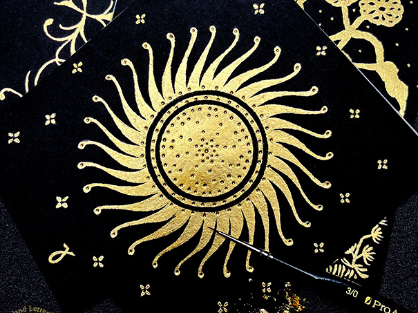
Simple shapes can make dramatic calligrams, these gothic roundels take the form of concentric and spiralling circles. The central space is left open in the Calm Calligram to emphasise the negative space. The more ornate Nevernight Spiral, inspired by Jay Kristoff's gothic novel, encapsulates a decorative capital in keeping with its subject. If you'd like to see more lettering in this style, take a look at my Gothic Calligraphy Practice folder.
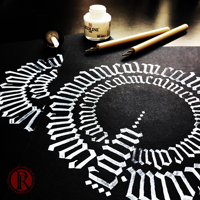
Calm Calligram
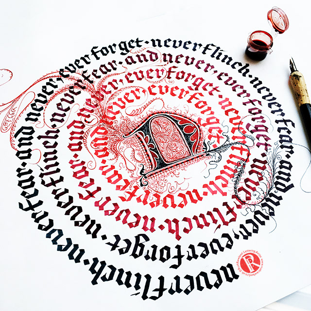
Nevernight Spiral Calligram
This softer style with spiralling brush lettering is gradually layered up with subtle shifts of colour. The darker Halloween piece is similarly layered but has added illustrative capitals to capture the haunting mood of the poem. This was a personal project and a lot of fun to work on, it's part of a larger worksheet, which you can see, amongst others, in my Journal folder.
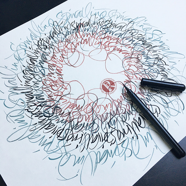
Gestural Spiral Calligram
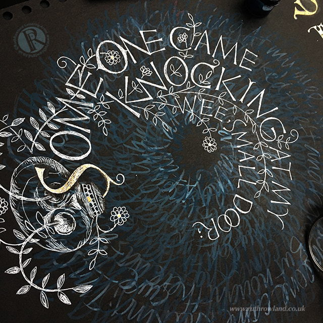
Someone Came Knocking Halloween Calligram
I often enjoy combining calligrams with illustration, seen in this piece inspired by Tomi Adeyemi’s wonderful novel, Children of Blood. The main character, Zélie, invokes her power by chanting an incantation, this illustrative calligram shows the surging words of power, interlaced with decorative details taken from traditional West African patterns.
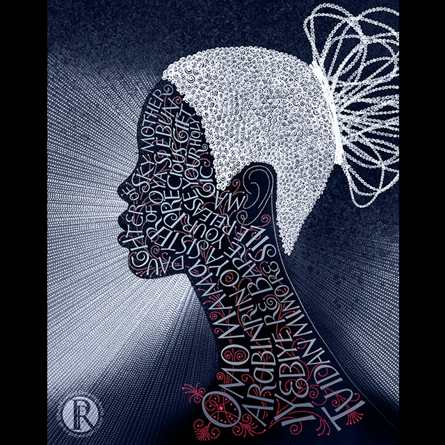
Zelie Illustrative Calligram
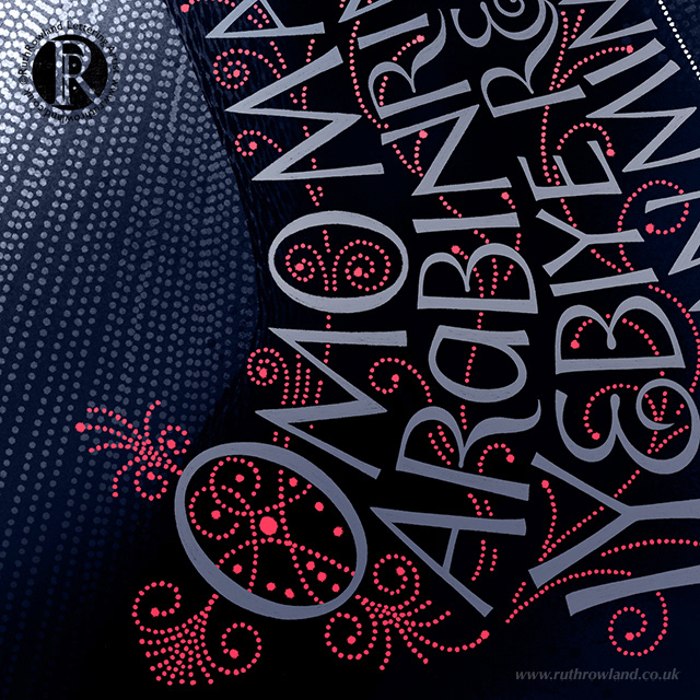
Zelie Illustrative Calligram: Decorative Lettering Detail
This calligram is one from a series of illustrations for Alan Garner’s much-fêted novel, The Owl Service, a story inspired by the Welsh myth of Blodeuwedd from the original 14th century manuscript, The Mabinogion. The illustration features the Slate of Gronw, an ancient stone, key to both myth and modern-day story inscribed with a shaped hand lettered quote from the novel. If you'd like to see more of this project, or the one above, you can find them in my Illustration folder.
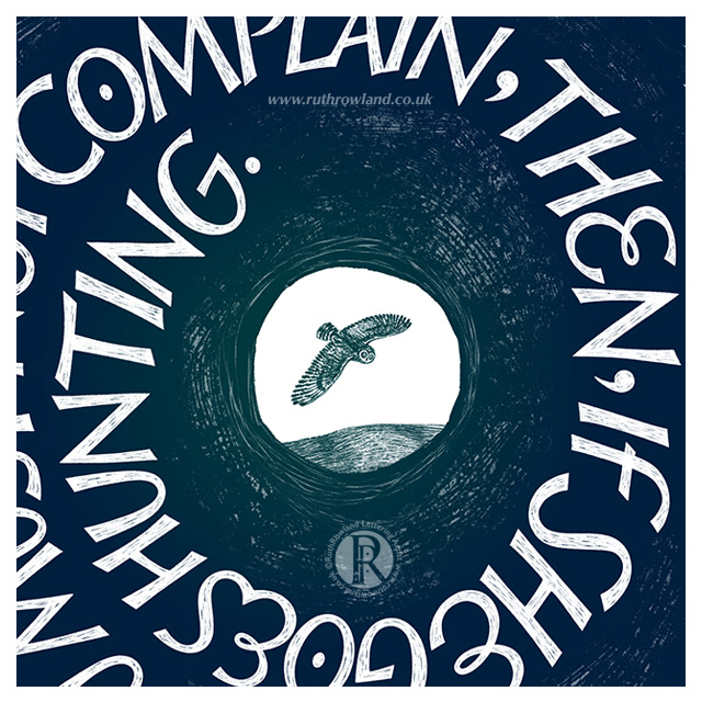
The Slate of Gronw (Llech_Ronw) Illustrative Calligram: Detail
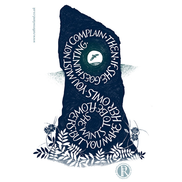
The Slate of Gronw (Llech_Ronw) Illustrative Calligram
I've worked on quite a few commissioned calligrams, including a couple for Simple Minds which include shaped lettering. This hand lettered winged-heart for the Simple Minds Tour Book names the people involved in the project, while this shaped graffiti lettering for the Celebrate album, uses song titles. Interesting projects, where the lettering is used to complement both graphic and photographic imagery. If you'd like to read more about the projects, you can find them in the Music folder.
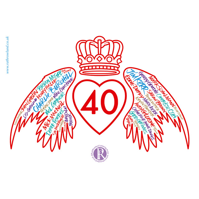
SimpleMinds 40 Tour Book Winged Heart Calligram
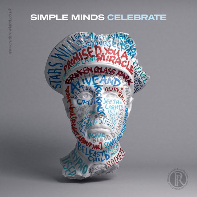
Simple Minds Calligram for Celebrate Album Cover
Finally, I'm rounding up this post with these two commissions, Election portrait calligrams for Aerial View Magazine and a series of hand lettered figures for the Nebianax brochure. In both these jobs, the calligrams are less abstract and more figurative, gradually built up with handwriting until they work as a whole. If you would like to see the fine detail, I've posted larger images in my Illustration folder.
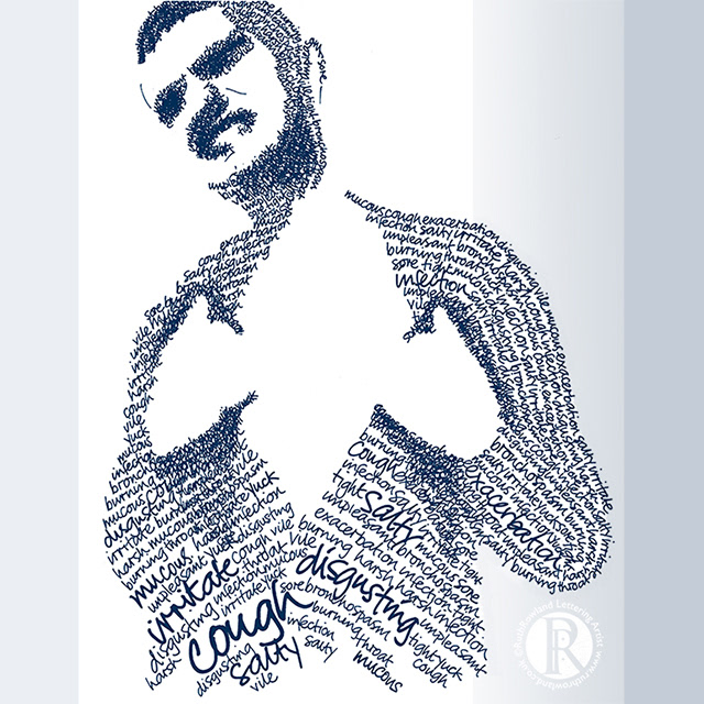
Illustrative Figure Calligrams for Nebianax Brochure
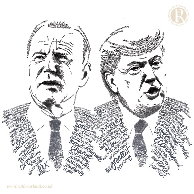
Election Portrait Calligrams for Aerial View Magazine
I hope you've enjoyed this overview, as my work progresses I plan to add more examples, so please do check back for updates.
