By Ruth Rowland
It was great to be asked by award winning design company, Ledgard Jepson, to work on the hand lettered hero message for Cleveland Containers campaign - Cleveland Can!
Cleveland Can! Hand lettered hero message for Cleveland Containers Advertising Campaign
The hand lettering demanded a bold brush stroke with a dynamic line to complement the energetic display font. Ledgard Jepson turned the uneven word length to their advantage by asking me to stack the lettering with negative space on the left, to frame imagery and balance the design.
The striking corporate yellow backgrounds were used as a unifying brand element across the the campaign, while the bespoke brush lettering added a free-flowing, human touch to the overall design.
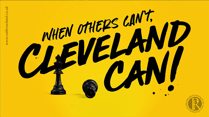
Cleveland Can! Hand lettered hero message for Cleveland Containers Video
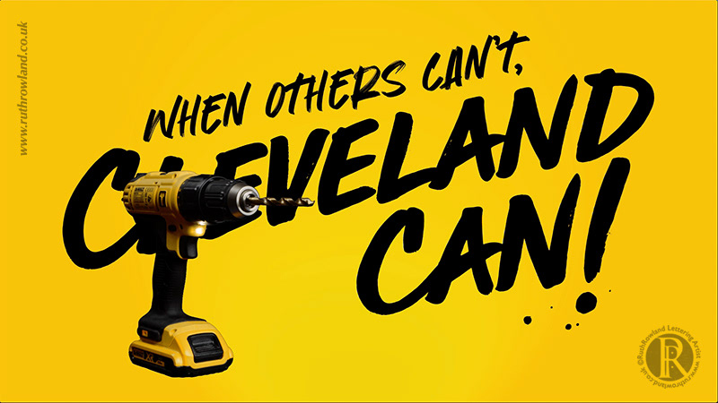
Cleveland Can! Hand lettered hero message for Cleveland Containers Video
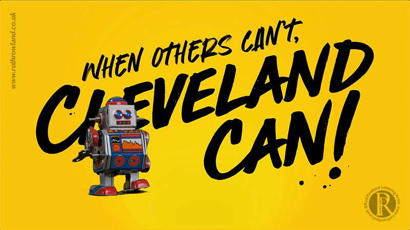
Cleveland Can! Hand lettered hero message for Cleveland Containers Video
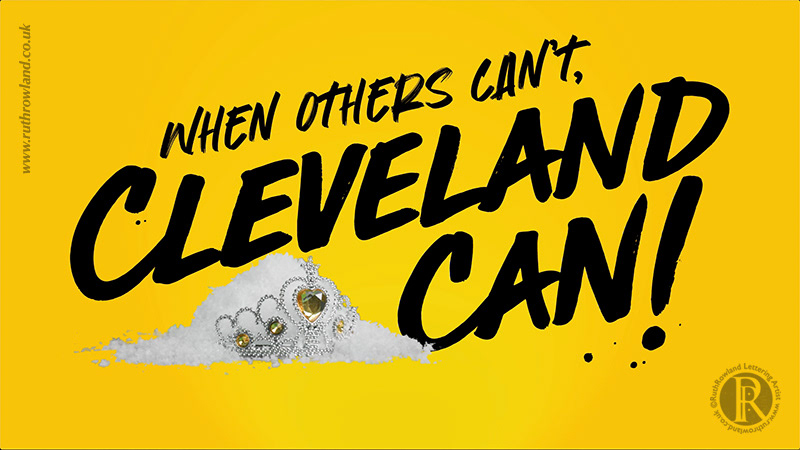
Cleveland Can! Hand lettered hero message for Cleveland Containers Video
Managing Director, David Exley, talks about the concept behind the campaign:
"Cleveland are the largest suppliers of containers in the UK, and their biggest selling point is their customer service. We created a value proposition ‘Cleveland Can’ and aimed to highlight the various touchpoints within the business, from hire through to sales and maintenance, putting people at the heart of the campaign.
We recommended some bespoke type from Ruth, and as ever she came up trumps with this heavy brush stroke type. With a long word ‘Cleveland' and a short word ‘Can’ it was potentially challenging, so our aim was to use the negative space to hold visuals."
Cleveland Can! Hand lettered hero message for Cleveland Containers Advertising Campaign
Find more of my lettering commissioned by Ledgard Jepson in my Advertising folder or take a look at the hand lettered logo for St Luke's Hospice.
