By Ruth Rowland
I always enjoy working on branding, so when Legard Jepson Design contacted me to help out with a new logo for St Luke’s Hospice, Sheffield, I jumped at the chance.
Custom Hand Lettering for St Luke's Hospice Logo
Ledgard Jepson, specialists in branding and well known for their recent rebrand of Birmingham Museums Trust, worked closely with the client to develop a logo that evokes a positive, upbeat message. It was decided this was best achieved with a piece of custom lettering, giving St Luke’s Hospice a unique, hand drawn mark that is instantly recognisable.
Custom Hand Lettering for St Luke's Hospice Logo
Once briefed, I collaborated with the creative team at Legard Jepson, providing initial brush drawn options. These were gradually developed and drawn up digitally, while taking care to retain the hand drawn appeal of the script.
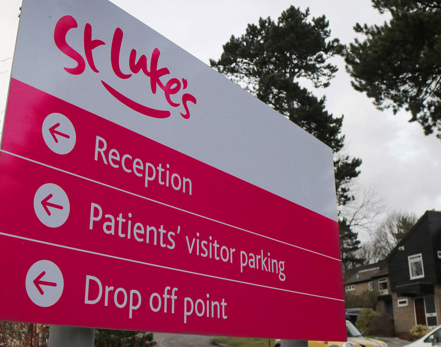
Hand Lettered St Luke's Hospice Logo: Signage
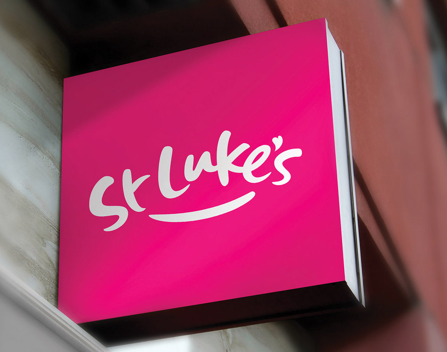
Hand Lettered St Luke's Hospice Logo: Signage
The warm colour, soft curves and playful nod at smiles and hearts keep the lettering fresh and friendly, while the bold weight and clean design give it the visual strength to work across a range of applications.

Hand Lettered St Luke's Hospice Logo: Applications

Hand Lettered St Luke's Hospice Logo: Applications
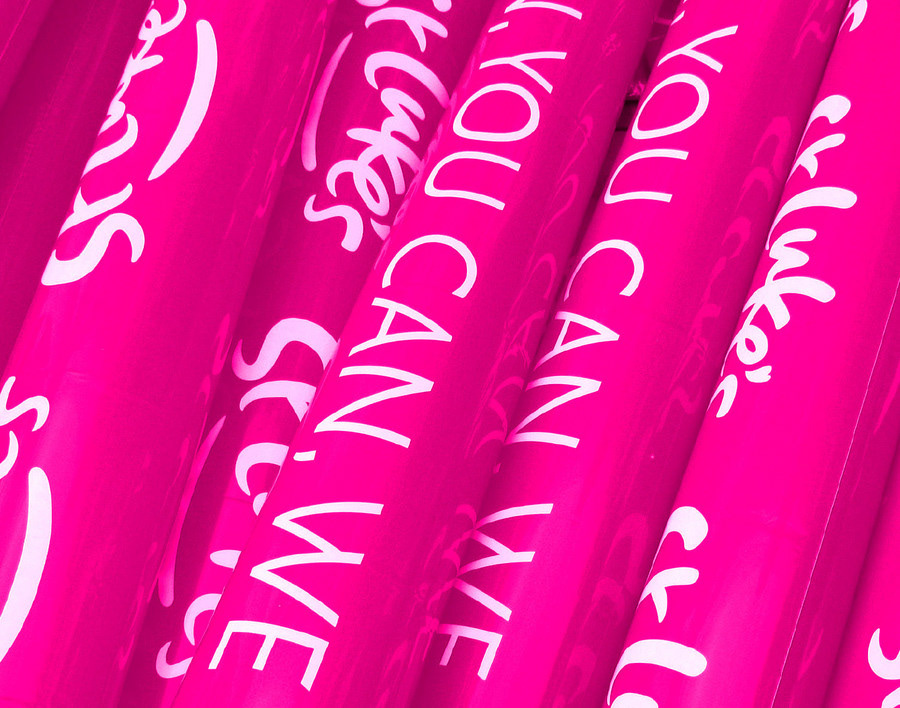
Hand Lettered St Luke's Hospice Logo: Applications
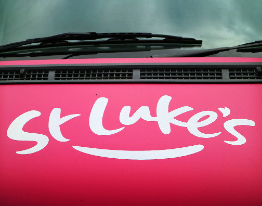
Hand Lettered St Luke's Hospice Logo: Applications
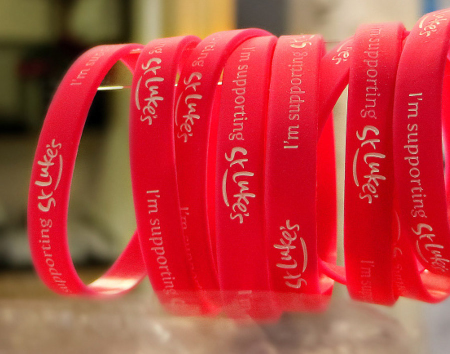
Hand Lettered St Luke's Hospice Logo: Applications
Head back to the logos folder in the menu or for something a bit different, take a look at my illustrative logo for Sarah Billing ...
