By Ruth Rowland
As a lettering artist for the graphics industry, I spend much of my time working on commercial projects but between commissions I like to practice calligraphy. Towards the end of last year I was looking for a 'hand' that would help me hone my flat brush skills.
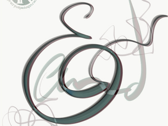
Neuland Flat Brush Lettering Sketchbook: Manipulating Strokes
Neuland Flat Brush Lettering Sketchbook: Spiral Calligram
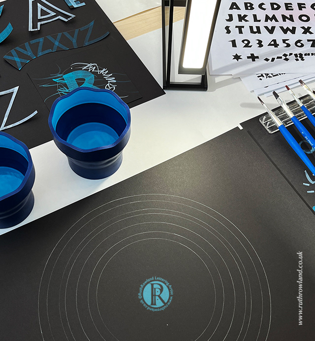
I decided on Neuland, a German typeface that was designed in 1923 by Rudolf Koch for the Klingspor Type Foundry. I wouldn't normally choose a typeface as my starting point but the simple angular forms were ideal for flat brush. The strokes can also be 'rounded up' with brush manipulation to create interesting sans serif forms.
Neuland Flat Brush Lettering Sketchbook: Spiral Calligram
Neuland Flat Brush Lettering Sketchbook: Layering Lettering
I was surprised at how much I enjoyed working with the flat brushes and with practice, I found them easier to manipulate than broad edge nibs. It was also quite liberating writing at a larger size using gouache, so I could control the flow and create interesting textures. This is the first time I've used gouache extensively and I loved experimenting with the matt, chalky texture on the black paper.
Neuland Flat Brush Lettering Sketchbook: Angular Forms
Neuland Flat Brush Lettering Sketchbook: Layered Waves
I have an ongoing interest in shaped lettering and calligrams, so using the theme of waves, I created layers of text with different forms and sizes of Neuland flowing across the page. As my flat brush worksheets were mounting up, I decided to make a concertina sketchbook from the A3 sheets and enter it into the SLLA Annual Exhibition at Gallery 101 in London. I displayed it as a 2 metre long hanging, with removable fittings, so it could be folded back to a sketchbook format to store in my studio.
Neuland Flat Brush Lettering Sketchbook: Detail Video
Neuland Flat Brush Lettering Sketchbook: Detail Video
I spent a morning at the exhibition talking about the joys of calligraphy practice and demonstrating Neuland brush lettering, which was a lot of fun. It was my first public event since the pandemic, so it was great to get such positive feedback from visitors.
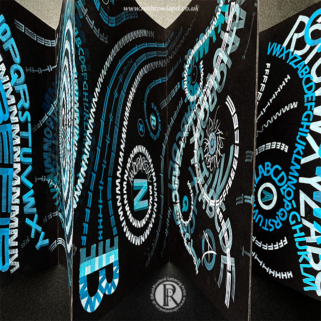
Neuland Flat Brush Lettering Sketchbook: Folded
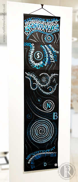
Neuland Flat Brush Lettering Sketchbook: Hanging
