By Ruth Rowland
Having worked on Bill Wyman's website logo for Stuart Crouch Creative, I was delighted to be asked to work on the album - Back to Basics.Pencil Lettering for Bill Wyman - Back to Basics
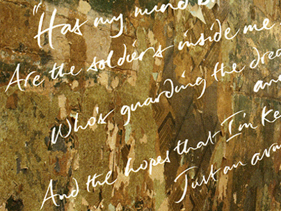
His first solo album here in the UK since 1982, Back to Basics is stripped back, clean and accomplished. To reflect this approach, I kept it simple - working with pencil, I produced sheet after sheet of name and title script until the forms were fluid and relaxed, yet still legible.
Pencil Lettering for Bill Wyman - Back to Basics (Back)
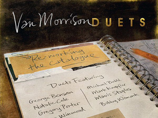
It's the art of apparent artlessness and takes a surprising amount of thought to get right. I’ve been working quite a bit with pencil recently and have enjoyed exploring its versatility as a lettering tool for this sort of spontaneous mark, as well as more built-up forms.
Pencil Lettering for Bill Wyman - Back to Basics (Disc)
The relaxed style was continued on the album inlay with song titles drawn and fitted to the shape of Bill’s guitar, with matching script on the disc labelling and the single, What & How & If & When & Why.
Pencil Lettering for Bill Wyman - What & How & If & When & Why Single
If you'd like to see more spontaneous lettering, click through to my loose brush lettered website logo for Bill Wyman or take a look at my logo and tracklist lettering for Paul Carrack ...
