By Ruth Rowland
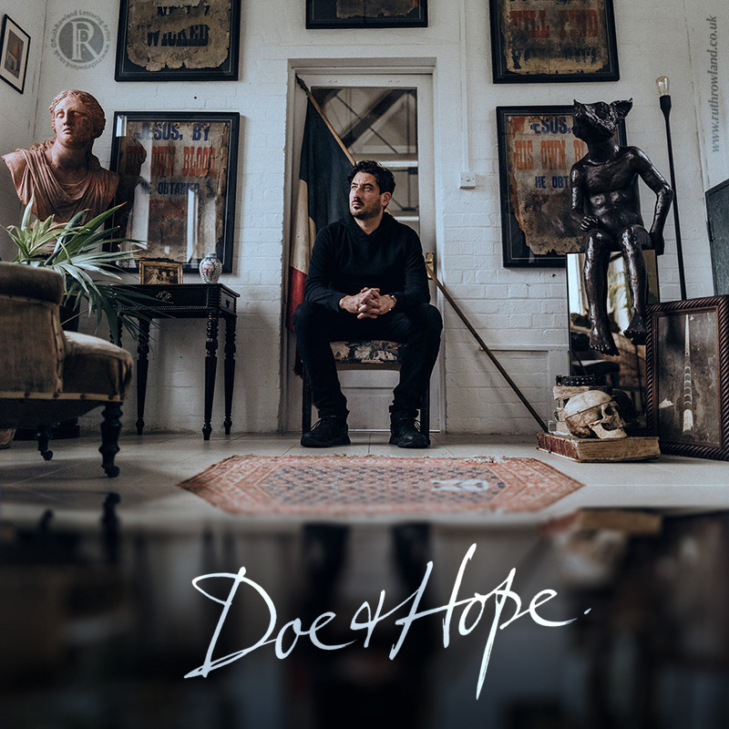
I was delighted to be asked by James Gooch, owner of antiques and art business, Doe & Hope, to work on a hand lettered logo.
Over the years James has built up a unique brand and he wanted to create a logo which reflected this aesthetic:
"Doe & Hope specialise in decorative, rare & unusual antiques and fine art from around the world with a particular interest in the atmosphere that surrounds an object, taking a cinematic approach in the presentation of our inventory. Our house style is probably best described as theatrical; being a concoction of old money, dramatic decorative, and faded gentility, with common themes of both humour and the macabre running through our inventory, that includes both academic and playful objects."
Hope & Doe Hand Lettered Logo
Photographer: James Gooch
It’s always a pleasure to work on such a personal project as the Doe & Hope logo. You only have to see James’ website to know that he has an art director’s eye for photography, so not surprisingly, he had a specific reference he wanted to use for the lettering style. With this reference as our starting point, we worked together to create a logo that is as personal to James as is his business:
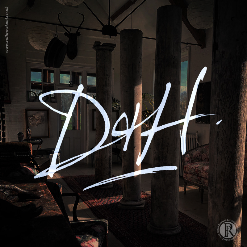
"Ruth understood the brief by getting inside the mind and eyes of the business which is rather niche, we wanted to create a very distinctive logo and one that had a very slightly macabre/threatening undertone without it being overly so. I wanted the cursive text to be akin to Daniel Plainview's handwriting in the film There Will Be Blood, so we worked together to loosely base the logo on his rather angry writing style which I think we achieved very well."
Hope & Doe Hand Lettered Logo
Photographer: James Gooch
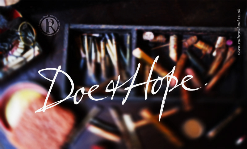
Taking inspiration from the iconic film, There Will Be Blood and in particular Daniel Plainview's powerful signature, I started by working with a range of pens and inks to capture the mood of the writing. I wanted the lettering to have the energetic, idiosyncratic feel of the handwriting but still have the strength and legibility needed for a logo.
As with all design projects, ideas went back and forth between myself and James in a creative dialogue, time well spent, as we were both very happy with the end result. Alongside the handcrafted Doe & Hope logo, I also created a matching D&H monogram.
Hope & Doe Hand Lettered Logo
Photographer: James Gooch
If you’d like to see more of my hand lettered branding, head over to my Logos folder or read about my brush lettered logo 'Love is all …' for fashion designer Rebecca Street.